# Load necessary packages using pacman for easier dependency management
pacman::p_load(
  sf,          # For handling shapefiles and geospatial data
  waffle,      # For creating waffle charts (visualization)
  showtext,    # For adding custom Google fonts and enabling font rendering
  ggtext,      # For enhanced text formatting, such as rich text in plots
  tidyverse,   # For comprehensive data manipulation and visualization
  glue,        # For string interpolation and dynamic text creation
  cowplot      # For combining and customizing plots
)

# Add local fonts from specified file paths for use in plots and text formatting
font_add("Font Awesome 6", here::here("fonts/otfs/Font Awesome 6 Free-Solid-900.otf"))
font_add("Font Awesome 6 Brands", here::here("fonts/otfs/Font Awesome 6 Brands-Regular-400.otf"))
font_add(family = "Rockwell-bold", regular = "C:/windows/Fonts/ROCKB.TTF")

# Add Google fonts directly, useful for consistent typography across visuals
font_add_google(name = "Roboto", "Roboto")
font_add_google(name = "Playfair Display", "Playfair Display")

# Enable custom fonts and set rendering options for improved quality
showtext_auto()  # Automatically render custom fonts in graphics
showtext_opts(dpi = 300)  # Set font rendering resolution for high-quality output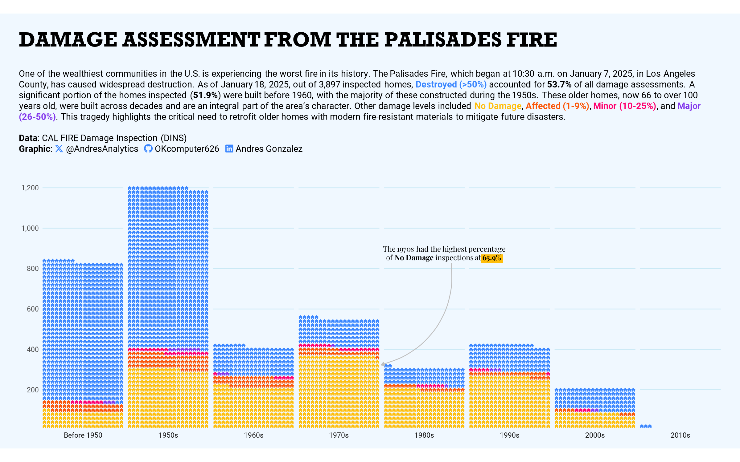
How This Graphic Was Made
1. 📦 Load Packages & Setup
2. 📖 Load and Prepare Data
3. 🕵 Filter and Transform Data
# Filter 'palisades' dataset for residential buildings and select relevant columns
palisades <- palisades %>%
  filter(UseType == "Residential") %>%
  select(YearBuilt1, HEIGHT, ELEV, geom)

# Perform spatial intersection to combine 'buildings' and filtered 'palisades' data
df <- st_intersection(buildings, palisades)

# Clean and transform data: handle missing values, filter by year, and categorize decades and damage levels
df <- df %>%
  drop_na(YearBuilt1) %>%
  filter(YearBuilt1 >= 1916) %>%
  mutate(
    decade = case_when(
      YearBuilt1 < 1950 ~ "Before 1950",
      TRUE ~ glue::glue("{floor(as.numeric(YearBuilt1) / 10) * 10}s")
    ),
    decade = factor(decade, levels = c("Before 1950", "1950s", "1960s", "1970s", "1980s", "1990s", "2000s", "2010s")),
    DAMAGE = factor(DAMAGE, levels = c("No Damage", "Affected (1-9%)", "Minor (10-25%)", "Major (26-50%)", "Destroyed (>50%)"))
  )
4. ⌨️ Summarize Data
# Summarize data: group by DAMAGE and decade, then count occurrences
damage <- df %>%
  group_by(DAMAGE, decade) %>%
  count() %>%
  ungroup()

# Calculate the maximum frequency of "Destroyed (>50%)" as a percentage
max_damage_freq <- df %>%
  group_by(DAMAGE) %>%
  count(DAMAGE) %>%
  mutate(freq = (n / sum(n)) * 100) %>%
  slice_max(freq) %>%
  pull(freq)

# Calculate the percentage of homes built before 1960
before_1960 <- df %>%
  mutate(homes = case_when(
    decade %in% c("Before 1950", "1950s") ~ "before 1960",
    TRUE ~ "1960s and rest"
  )) %>%
  group_by(homes) %>%
  count(homes) %>%
  mutate(freq = (n / sum(n) * 100)) %>%
  slice(2) %>%
  pull(freq)

# Identify the decade with the highest percentage of "No Damage"
best_decade <- df %>%
  group_by(decade, DAMAGE) %>%
  count() %>%
  ungroup() %>%
  group_by(decade) %>%
  mutate(freq = n / sum(n) * 100) %>%
  ungroup() %>%
  filter(DAMAGE %in% "No Damage") %>%
  slice_max(freq) %>%
  pull(freq)
5. 🔤 Text
social <- andresutils::social_caption(
  bg_color = "#F0F8FF",
  icon_color = "#3a86ff",
  font_color = "black",
  font_family = "Roboto",
  linkedin = "Andres Gonzalez"
)

title <- toupper("Damage Assessment from the Palisades Fire")

st <- paste(
  "One of the wealthiest communities in the U.S. is experiencing the worst fire in its history. ",
  "The Palisades Fire, which began at 10:30 a.m. on January 7, 2025, in Los Angeles County, has caused widespread destruction. ",
  "As of January 18, 2025, out of 3,897 inspected homes, ",
  paste0("<span style='color:#3a86ff;'>**Destroyed (>50%)**</span> accounted for **",
         round(max_damage_freq, 1),
         "%** of all damage assessments. "),
  paste0("A significant portion of the homes inspected (**", round(before_1960, 1), "%**) were built before 1960, with the majority of these constructed during the 1950s. "),
  "These older homes, now 66 to over 100 years old, were built across decades and are an integral part of the area's character. ",
  "Other damage levels included <span style='color:#ffbe0b;'>**No Damage**</span>, ",
  "<span style='color:#fb5607;'>**Affected (1-9%)**</span>, ",
  "<span style='color:#ff006e;'>**Minor (10-25%)**</span>, and ",
  "<span style='color:#8338ec;'>**Major (26-50%)**</span>. ",
  "This tragedy highlights the critical need to retrofit older homes with modern fire-resistant materials to mitigate future disasters."
)

cap <- paste0(
  st,
  "<br><br>**Data**: CAL FIRE Damage Inspection (DINS)<br>**Graphic**: ", social
)
6. 📊 Plot
# Create a pictogram chart to visualize damage levels across decades
p <- damage %>%
  ggplot() +
  geom_pictogram(
    mapping = aes(
      label = DAMAGE, color = DAMAGE, values = n
    ),
    flip = TRUE,
    n_rows = 20,  # Number of rows per pictogram group
    size = 1,     # Size of the pictogram icons
    family = "Font Awesome 6"  # Use Font Awesome icons for visualization
  ) +
  scale_label_pictogram(
    name = NULL,  # No legend title
    values = rep("home", 5)  # Use "home" icon for all damage levels
  ) +
  scale_colour_manual(
    values = c("#ffbe0b", "#fb5607", "#ff006e", "#8338ec", "#3a86ff")  # Custom color palette for damage levels
  ) +
  scale_x_discrete(
    expand = c(0, 0, 0, 0)  # No expansion for x-axis
  ) +
  scale_y_continuous(
    labels = function(x) format(x * 20, big.mark = ","),  # Format y-axis labels for clarity
    expand = c(0, 0),  # No expansion for y-axis
    minor_breaks = NULL
  ) +
  facet_wrap(~decade, nrow = 1, strip.position = "bottom") +  # Facet by decades
  labs(
    title = title,       # Add title from the earlier narrative
    subtitle = cap       # Add subtitle with detailed text
  ) +
  coord_fixed() +        # Ensure consistent scaling
  theme_minimal(         # Minimalistic theme for cleaner visuals
    base_family = "Roboto",  # Font family for text
    base_size = 7           # Base font size
  ) +
  theme(
    legend.position = "none",  # Remove legend
    plot.title.position = "plot",
    plot.margin = margin(5, 15, 5, 15),  # Add padding around the plot
    plot.background = element_rect(fill = "#F0F8FF", color = "#F0F8FF"),  # Light blue background
    panel.background = element_rect(fill = "#F0F8FF", color = "#F0F8FF"),
    panel.grid.major = element_line(
      linewidth = 0.3,
      color = "#CAE9F5"  # Light grid lines
    ),
    plot.title = element_textbox_simple(
      margin = margin(b = 5, t = 10),
      family = "Rockwell-bold",  # Font for title
      size = 16
    ),
    plot.subtitle = element_textbox_simple(
      margin = margin(b = 25, t = 10),
      lineheight = 1.2  # Adjust subtitle spacing
    )
  )

# Add annotations to emphasize key insights on the plot
final_plot <- ggdraw(p) +
  annotate(
    "segment", y = 0.44, x = 0.65, xend = 0.68, color = "#ffbe0b", linewidth = 3.2  # Highlight a specific area
  ) +
  geom_richtext(
    aes(
      x = 0.60,
      y = 0.45,
      label = paste0(
        "The 1970s had the highest percentage<br>",
        "of **No Damage** inspections at **", round(best_decade, 1), "%**"
      )
    ),
    size = 2,
    family = "Playfair Display",  # Use decorative font
    fill = NA, label.color = NA  # Remove label background and border
  ) +
  geom_curve(
    aes(x = 0.61, y = 0.43, xend = 0.515, yend = 0.21),
    arrow = arrow(length = unit(0.1, "cm"), type = "closed"),  # Add an arrow for emphasis
    color = "grey75", linewidth = 0.3, curvature = -0.4  # Light curve for subtle highlight
  )
7. 💾 Save
# Save the final visualization as a PNG file
ggsave("Palisades Houses.png", plot = final_plot, height = 5, width = 8)
8. 🚀 GitHub Repository
TipExpand for GitHub Repo
Explore the complete code for this visualization in the following Quarto file: Palisades Houses.qmd.
For additional visualizations and projects, click here.
Citation
For attribution, please cite this work as:
Gonzalez, Andres. 2025. “Damage Assessment From The Palisades
Fire.” January 20, 2025. https://andresgonzalezstats.com/visualization/Visualizations/2025/LA
Wildfire/Palisades Houses.html.